
Role & Responsibility
Team: Project lead and designer, with 3 Web Engineers
Responsibilities: User testing, UX/UI design, stakeholder management
Length: 3 Months
The Challenge
Many TravelBank and Brex customers have stated that they do not like TravelnBank’s current booking and policy approval experience because it doesn’t accommodate the ability to book and view information for more than one traveler at a time.
Business Goals:
TravelBank offers both corporate businesses and Brex credit card customers a travel management platform to book all flights, hotels, and rental cars. However, Brex voiced that booking one traveler at a time was a huge limitation in their experience. Additionally, an increasing amount of Brex customers are booking travel through their phone.
Multi traveler booking functionality and responsive web optimization was necessary for Brex to continue its contract with TravelBank.
The Solution
I led the design for the ‘Group Bookings’ feature to be introduced within TravelBank’s corporate travel booking and policy approval experience and introduced an updated functionality of booking and approving travel for up to 7 travelers.
Book Travel for up to 7 Travelers at Once
For all flight, car, and hotel travel bookings, users can now review information and book travel for up to 7 travelers.
Easily add, edit, and remove travelers during the check out experience.
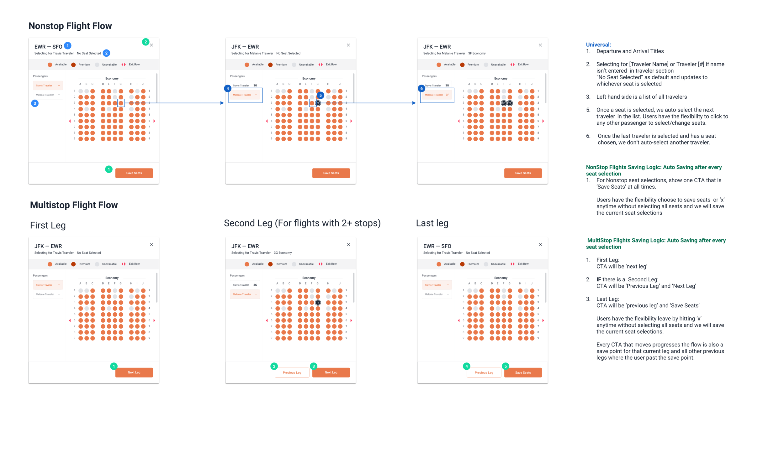
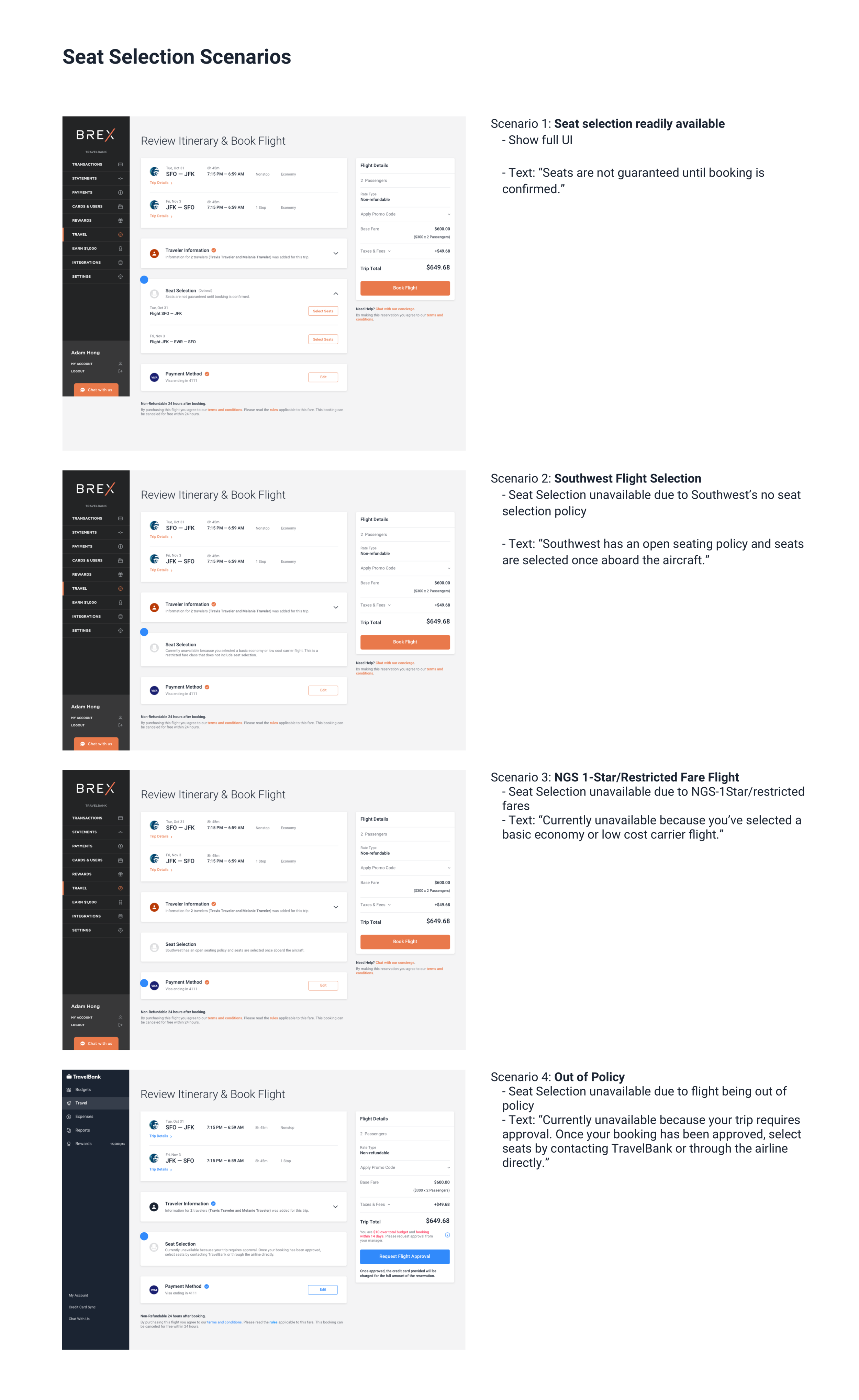
Flexible Seat Selection
Select seats for all your travelers in one way, round trip, or multi-city flights.
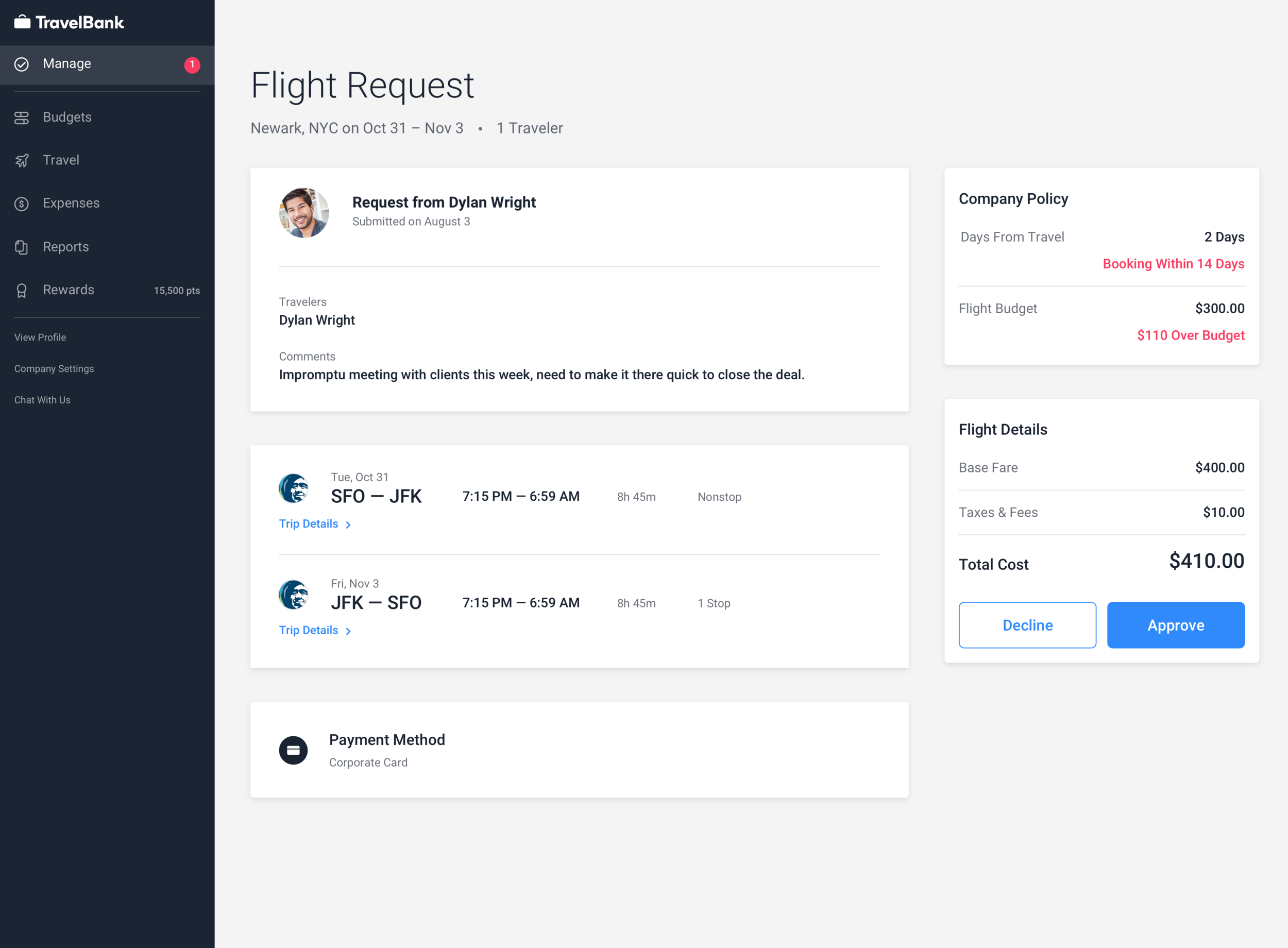
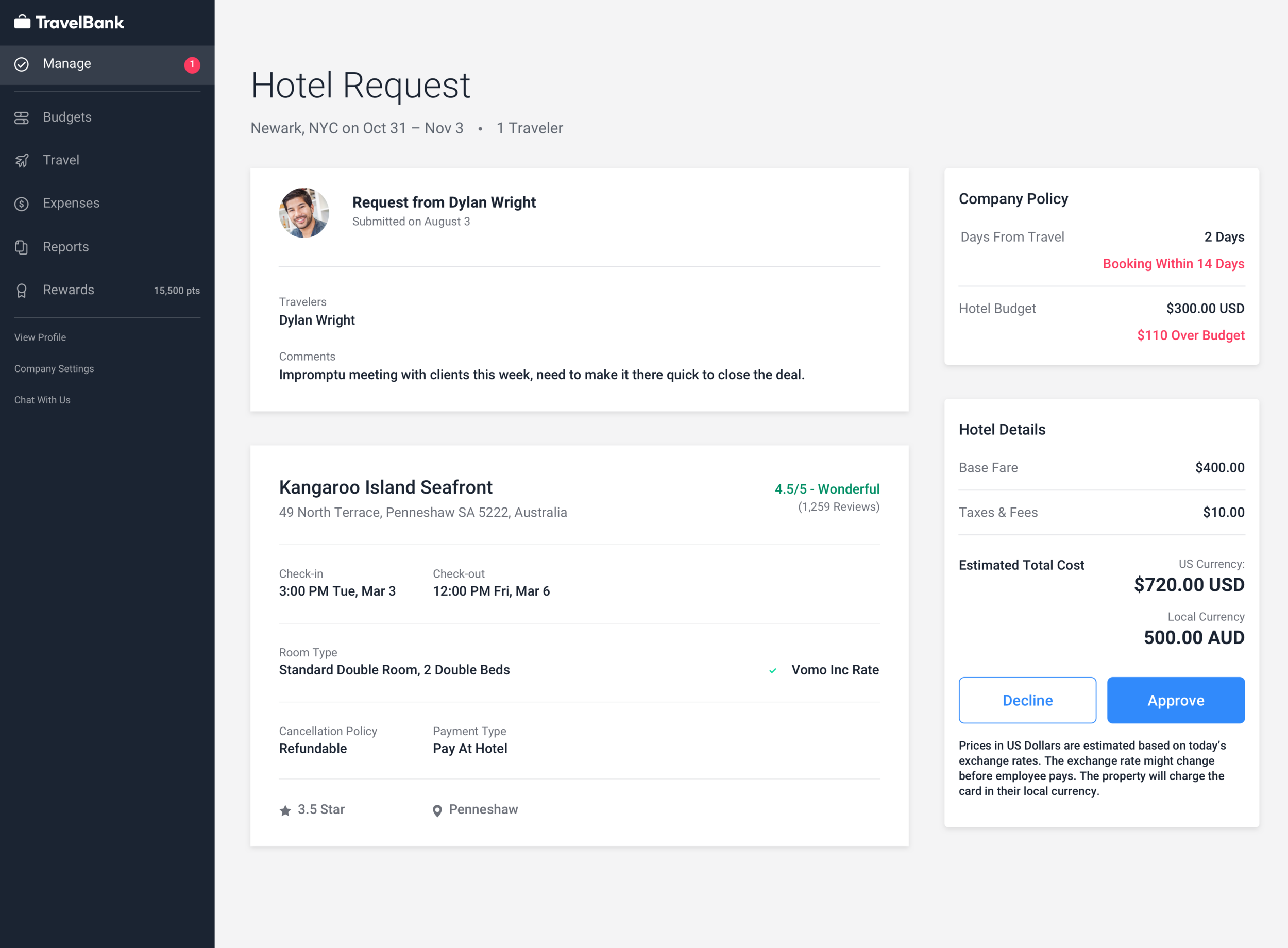
Approve or Decline Travel Requests
Managers have increased visibility of detailed booking information and travelers associated with the booking.
Managers can also see what specifically went over company policy and can address issues right away.
Review of the Current Experience
It was clear that I had to update our feature to accommodate booking for more than 1 traveler, however through talking to customers and being in contact with our Customer Success team, it was clear to me that there was several pain points that I needed to address.
Current Pain Points across Traveler Booking and Approval Experience
Flight details component has unclear hierarchy of information
Current seat selection functionality is hidden to some users and layout is not scalable for multiple travelers
Current traveler information experience is a tab style which makes it hard to view traveler information since of the constant back and forth
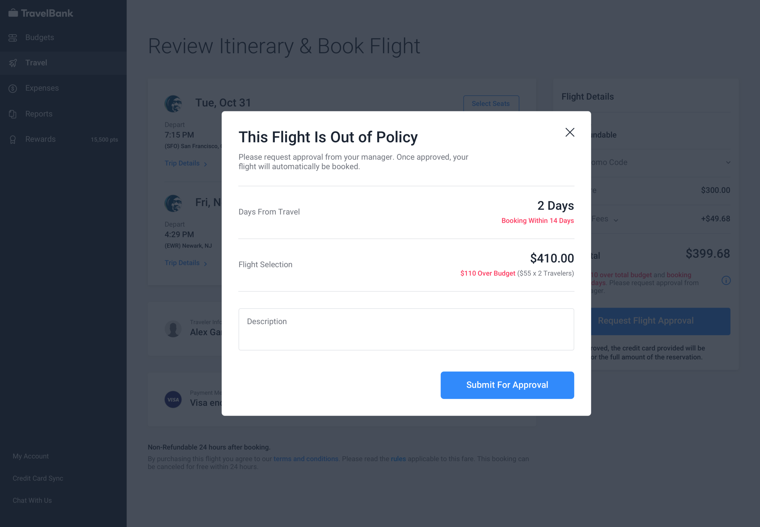
The current approval flow was not optimized for reviewing details for multiple travelers including clarity on out of policy budget and flight fare breakdown
Design Iterations
This project had me explore designs for the booking checkout experience and the manager approval experience.
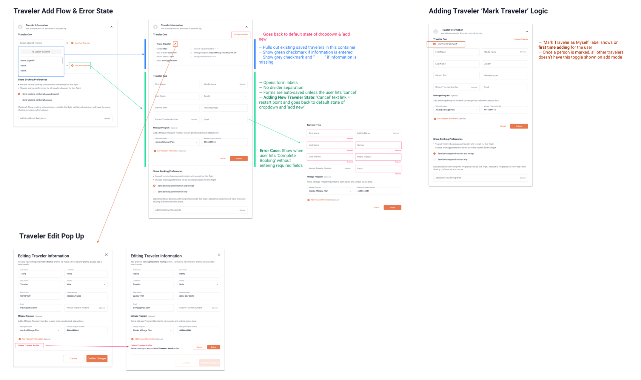
Problem 1: Updating the Traveler Component to Accommodate Multiple Travelers
Need a clear view and visualize UI state differences for add, edit, and review traveler information for up to 7 travelers
How to decrease information overload when viewing multiple traveler information
My first iteration addressed current customer feedback that the ability to remove a traveler was hidden. As my iterations continued, I received more validation to move towards a dedicated modal state for add and edit in hopes to minimize information overload and page length.
Problem 2: Updating Seat Selection to include Multiple Travelers
Needed to clearly see number of respective legs and selected seat so that users can ensure all information is correct.
Ability to assign multiple travelers to seats in one flow to reduce number of steps.
As the first step to improving visibility of seat selection, this part was broken into two different sprints. For the first part, I quickly addressed customer feedback that the ‘Seat Selection’ CTA seemed hidden. Hearing this feedback, I thought separating the functionality to its own separate section would call more attention to it. My second step was to understand how to scale seat selection shown for more than 1 traveler when it was a one stop, round-trip, or multi-city flight.
After launch, product support started receiving less feedback about ‘Seat Selection’ being missed which was a huge win.

Problem 3: Updating Manager Approval Price Breakdown to Accommodate Multiple Traveler Prices
Need a way to view all travelers and related details involved in the group booking requests to help managers make an informed decision to approve or decline a request.
The old manager approval flow was not optimized for reviewing details for multiple travelers including clarity on out of policy budget and flight fare breakdown. I had to balance how to display out of policy information and price details and establish the logic if the price was per traveler or for the whole booking.
I started off with different assumptions of what I thought managers wanted to see when reviewing their approvals and validated these designs with my design team and with managers within TravelBank.

Spec Documentation
To help our remote engineers better understand the different flows for various parts of the feature, I provided detail design specifications within our JIRA tickets and also provided a series of documentation to help explain interactions. Throughout design QA, both the engineering team and I referenced the documentations as the source of truth.
Designing a Responsive and Native Mobile Experience
A Responsive Web Experience for Brex
The need for a responsive experience was necessary because research has shown that Brex customers have booked travel via their mobile web browser. Ensuring the same seamless experience shines through with mobile, I worked with our engineers to map out the responsive experience including dedicated interactions when viewing content in a small screen.
Feature Parity Between Web & Native
The flow to book for more than one traveler currently does not exist in our native application because majority of TravelBank users book through the web dashboard. However, the flow for managers to review and approve travel requests does exist on native. Drawing from the same experience and logic, I updated the native experience to incorporate the optimization to review details for more than one traveler in a request.
Outcome
Impact
Successfully launched on all TravelBank and Brex users on November 2019 - Blog Post.
TravelBank has seen a 15% increase in total books among the booking platform.
Incorporate Existing Feedback Early
I was able to incorporate a more user interview involved process by pushing for customer interviews at the beginning to identify other UX issues we should focus on
Fight for Good UX
With the support of product and engineering, I pushed for the redesign and re-organization of some components within the booking flow in addition to the functionality of ‘Group Bookings’